
An App Store page is crucial for people to understand the app’s purpose and how it will benefit them. Research indicates that apps with well-designed icons and screenshots can lead to up to a 30% increase in downloads. That’s why an optimised App Store page can significantly impact how many downloads your app gets. In this post, we’ll take a look at what it takes to create an impactful App Store page.
Making a Memorable App Icon
The first thing users see when browsing the App Store or Google Play Store is the app icon. Like a product on a store shelf, it needs to catch the eye while conveying the app's essence. Users instantly get a sense of the app's feel and functionality from the icon, which may influence whether or not they look at the App Store page.
Dark Mode and Tint Variants
With Apple’s latest iOS 18 update, you should also consider how your app icon would look in a dark and tinted version so that it maintains its visual appeal.
Dark Mode: Modify your design to work well against Apple’s default dark mode background, using tones that maintain sufficient contrast and darkening overly bright colours.
Tint Variants: Create a grayscale version of your icon so that the system can apply a coloured tint. It’s best to avoid large areas of semi-transparency and fine details. Consider adding a vertical gradient to enhance the design.
What to Avoid When Designing an App Icon
Don’t include the app name, as the app name is usually redundant when users see the icon alongside the app name in search results.Avoid excessive details and photos as too much detail can make the icon look cluttered, especially at smaller sizes. Avoid replicating standard UI components or screenshots in your icon as it can clutter the design, opt for a simplified vector instead.
Providing the Correct Assets
Apple App Store:
Requires a 1024x1024 pixel icon image with rounded corners and no transparency.
Ensure the icon looks great at various sizes, considering fewer details in smaller versions.
Google Play Store:
Requires a 512x512 pixel icon image, allowing for a transparent background if needed.
Creating Standout Screenshots and Previews
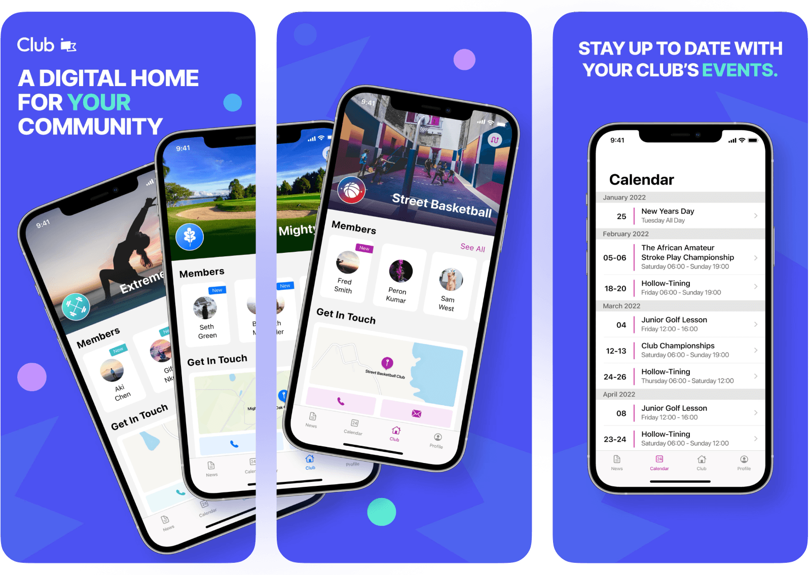
App Store Screenshots
Screenshots are excellent ways to visually demonstrate what an app can do. They are more than just images; they tell a story about the app and can get people excited about its functions. Clearly communicating the core functionality of the app is crucial to getting users to download it.
Highlight Key Features
Select screenshots that showcase the app’s core functions and unique selling points. Users should get a sense of what using the app is like just by glancing at the interface. High-resolution and visually captivating screenshots leave a standout impression.
Explain and Delight
Add brief captions to explain each screenshot, making it easier for users to understand the benefits at a glance. Using less text keeps it easy to read and skim through.
What Not to Do When Creating Screenshots
When creating screenshots, avoid using low-quality images and keep the design clean and focused on one feature at a time. Steer clear of irrelevant or inaccurate screenshots, which might lead to disappointment. Additionally, consider localisation by creating versions of your screenshots for different languages to cater to users browsing the app store in a different language.
Avoid using custom devices. Either remove the device bezel, or use an approved Apple device which is available here
Providing The Correct Assets
Apple App Store:
Allows up to 10 screenshots.
The first one to three screenshots show in search results if there’s no video preview, so ensure these communicate the essence of the app.
Screenshots of the app’s interface must match the live version to avoid rejection.
Google Play Store:
Permits between 2 and 8 screenshots per device type.
Typically, 5-8 screenshots are the sweet spot for communicating an app’s functions.
App Previews
App previews are video demonstrations that can effectively showcase the app’s features and usability. They offer a dynamic way to engage potential users by visually walking them through the app's core functionalities.
Keep it Short
A 30-second video preview that shows the app in action is usually enough to capture attention. Focus on highlighting key features and demonstrating how the app solves a user’s problem.
Focus on Usability
Highlight how intuitive and user-friendly your app is. Show actual usage scenarios to help potential users envision themselves using the app.
Include a Call to Action
Encourage viewers to download the app by ending with a clear call to action. This motivates users to take the next step after watching the preview.
What Not to Do When Creating App Previews
Avoid using low-quality footage and unnecessary transitions that can detract from the app’s functionality. Ensure the video is a genuine representation of the app’s capabilities to avoid misleading users.
Providing The Correct Assets
Apple App Store:
Videos should be between 15 to 30 seconds long.
Ensure they showcase the app’s most important features clearly and engagingly.
Google Play Store:
Recommends video previews between 30 seconds to 2 minutes long.
Ensure the video is concise yet comprehensive, covering the app’s primary functions.
Informative App Description
Users want to know how the app will make their life better, which is where the app description comes in. Focus on what makes the app unique and how it can solve users’ problems or enhance their lives. Avoid jargon and lengthy paragraphs to keep the text easy to read and understand. The app description is essential in communicating what the app does, who it’s for, and why it’s worth downloading.
Start Strong
When creating screenshots, avoid using low-quality images and keep the design clean and focused on one feature at a time. Steer clear of irrelevant or inaccurate screenshots, which might lead to disappointment. Additionally, consider localisation by creating versions of your screenshots for different languages to cater to users browsing the app store in a different language.
Use Keywords to Boost Search Ranking
Use relevant keywords when describing the app to improve search-ability within the app store’s search ranking. Focus on words that users would search for if they were looking for the app specifically.
What Not to Do When Writing an App Description
Avoid using technical jargon that might confuse potential users. Long paragraphs with excessive detail can overwhelm users, so keep the description concise and to the point. Generic statements like "best app ever" add no real value, so be specific about what makes your app unique. Lastly, avoid keyword spamming, as overusing keywords can make the text hard to read and might lead to penalties from the app store.
Providing The Correct Assets
Apple App Store:
Allows up to 10 screenshots.
The first one to three screenshots show in search results if there’s no video preview, so ensure these communicate the essence of the app.
Screenshots of the app’s interface must match the live version to avoid rejection.
Google Play Store:
Permits between 2 and 8 screenshots per device type.
Typically, 5-8 screenshots are the sweet spot for communicating an app’s functions.
Product Page Optimisation
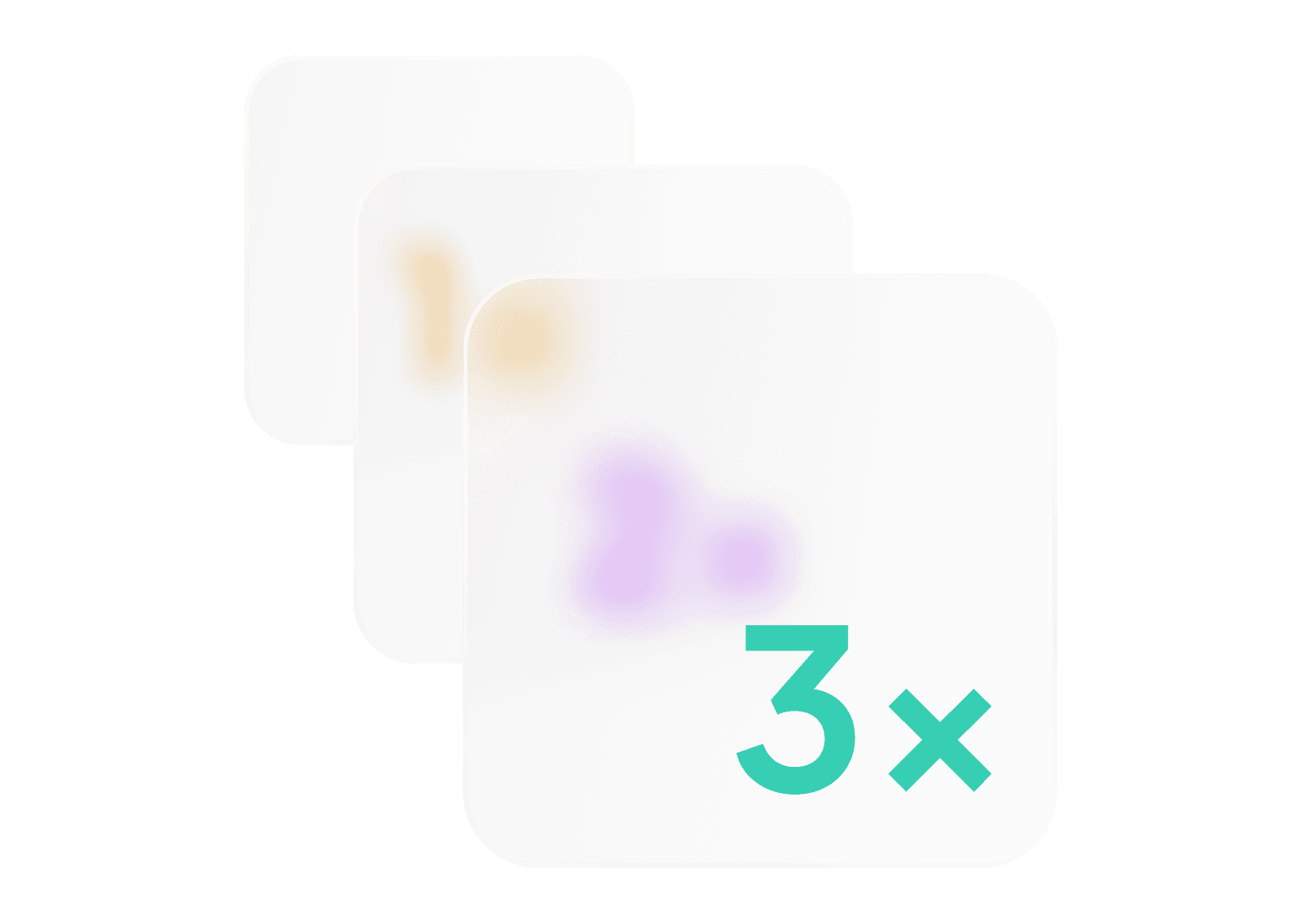
With Product Page Optimisation on the Apple App Store, you can test different elements of your app's product page to find the most engaging versions. You can compare up to three alternate product page versions against the original and view the results in App Analytics. This feature allows you to experiment with different icons, screenshots, and app previews to see which combinations drive the most downloads. Alternate versions, or "treatments," are shown to randomly-selected users, and you can track performance to make data-driven decisions about which elements to implement permanently.
Conclusion
An optimal app store page is a powerful tool for enhancing an app’s success and getting it seen by the right users. Clean design and powerful writing are key to making sure your app’s value is properly understood. By focusing on a memorable app icon, engaging screenshots, and a well-crafted app description, your app can stand out in the busy app market and transform curious browsers into loyal users.


